Industrial Landscape, Ashton-under-Lyne, by Laurence Stephen Lowry
Perceptual Mapping for Entrepreneurs
using MicrOsiris
Launching a new venture implies the construction, launch and management of a new brand which will then compete for attention in the minds of prospective consumers. Consequently, it would be extremely useful for entrepreneurs to know how their rivals' brands stack against each other in order to position the entrepreneurial brand in an ideal "sweet spot" that others may have overlooked.
Perceptual mapping is a technique that allows us to do this. Specifically, using perceptual maps, the entrepreneur can (1) determine the main dimensions that consumers use when thinking about these brands and (2) each brands' position (including the entrepreneur's) on this map.
What's the advantage over entrepreneurs that do not use perceptual mapping?
Market-oriented entrepreneurs will have advantages with their target market and with investors if they use perceptual mapping:
|
Market advantage
|
This entrepreneur will "position" his brand with no information on how consumers think and organize brands in their mind, inviting failure.
|
A market-oriented entrepreneur will map consumers' mind and pick an ideal location -uncluttered and promising- to position his product, minimizing risk of failure.
|
|
Investor advantage
|
This entrepreneur will come to investor meetings armed with no information on how consumers perceive rival brands. This can generate suspicion as to whether the entrepreneur is backing his claims with rigor.
|
This entrepreneur will back up his claims with real data on consumers' perceptions of rival brands. This is likely to give investors' more confidence over other entrepreneurs when making investment decisions.
|
What do entrepreneurs need to make a perceptual map?
- A survey that records consumers' ratings of competing brands (and possibly the entrepreneur's) on a scale from 1 to 10 along several attributes. For example, one could ask consumers to rate Bing, Yahoo! and Google in terms of search speed, relevance of search results, youthfulness of brand image, and so forth.
- Software packages, namely Microsoft Excel, XYChartLabeler and MicrOsiris.
How can entrepreneurs make a perceptual map?
Making perceptual maps is quite simple and can be broken down into several steps.
The first task is to figure out exactly how consumers' organize information about products and brands in their minds. This makes sense: to position our offering in the consumers' mind, we first need to know how it looks!
Prepare consumer data for analysis
The entrepreneur must calculate the average rating for each brand on each attribute the consumer evaluated. Consequently, when recording survey responses, the entrepreneur can assemble the survey data as follows:
SPEED RELEVANCE
Survey # Bing Yahoo! Google Bing Yahoo! Google
1 7 6 8 9 8 8
2 10 5 5 10 6 7
3 3 9 8 6 8 8
4 9 9 10 8 9 10
In this example we have the first four recorded surveys for consumers who rated different Internet search engines along two attributes: speed and relevance of search results. After assembling the data as above, it is very easy to create a table of averages by simply taking the average of each column and arranging the averages as shown:
Brand Avg. Speed Avg. Relevance
Bing 7.25 8.25
Yahoo! 7.25 7.75
Google 7.75 8.25
This data is in the right format. You can have many brands and many attributes.
Save data in the appropriate format
In order to use your Excel table in MicrOsiris, you will need to save the table in a special format called CSV. The following slideshow shows you how to do this using an example with car brands:
After you click "Don't Save", you will exit Excel (don't worry, your file IS saved!).
Use MicrOsiris to perform statistical analysis
Once you have your data in CSV format, open MicrOsiris and follow the steps below to produce the results needed to plot the perceptual map. MicrOsiris uses a technique called Factor Analysis to produce such results. The following slideshow will guide you through the process. It uses a dataset of cell phone brand ratings. Familiarize yourself with the data before proceeding.
Note that in this dataset we have three "segment" variables in addition to the attributes of each cell phone. These are the cell phone averages as reported by specific consumer segments. If you have information on meaningful segments, you can produce these columns.
Use Excel to interpret the results from the perceptual map
The output data from MicrOsiris will be used to create the perceptual map. First, however, let's understand what the output from MicrOsiris actually means. Familiarize yourself with the output data, then follow the steps in the slideshow below.
The output data from MicrOsiris will be used to create the perceptual map. First, however, let's understand what the output from MicrOsiris actually means. Familiarize yourself with the output data, then follow the steps in the slideshow below.
Instead of saving the output data as above (.CSV", you may have saved a file with an extension "PRT which cannot be opened directly in Excel. If so, open Excel, then drag the .PRT file into a blank Excel spreadsheet. The file will open. Then save it in Excel or CSV format.
What are these numbers highlighted in red and green? Why do we care about them?
Consider that we asked consumers to rate products along a large number of attributes. Some of these may be related to each other. For example, it is plausible that consumers who rate the iPhone 5 with a "10" in Attractiveness will probably rate it highly as well in Modernity. Said differently, the ratings that consumers give us, and which we then average, are correlated with one another.
The reason for this correlation is not merely quantitative. Consumers think about brands, product, services, ideas (and even people!) considering a large number of attributes. They then summarize this information in "broad strokes". For example, when consumers compare one product to another, they think about one or two hidden or latent dimensions that best describe the product. In turn, these dimensions -called "factors"- are related to several product attributes.
The relation between the factors and the attributes consumers rated is measured using the numbers we just highlighted. Called "loadings", they represent how strongly each attribute relates to each factor. This, of course, is key for our analysis, as it allows us to understand what the hidden factors we just found mean!
Determining the meaning of each factor is simple. Look at the highlighted loadings within each factor. Then,
Simple! This is the result for our smartphone data:
Factor 1 Factor 2
"Not cutting edge" "Overall quality"
NOT attractive Fast
BAD photo quality Durable
NOT exciting MANY apps
FEW apps FAST Internet
UNCLEAR screen Great value
SLOW Internet Segment 2 DOES like
BAD sound Segment 3 DOES like
Economical
NOT modern
NOT for prestigious people
Segment 1 DOES NOT like
Now that we have this list, it is easy to come up with the names for both factors. Factor 1 is associated with ugly, slow, cheap phones. Therefore, Factor 2 is associated with high quality phones.
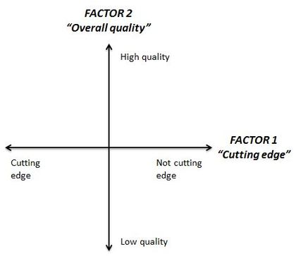
One critical characteristic of the factors we extracted is that they are independent of each other. Therefore, we now know that consumers organize information in the following way:
Consider that we asked consumers to rate products along a large number of attributes. Some of these may be related to each other. For example, it is plausible that consumers who rate the iPhone 5 with a "10" in Attractiveness will probably rate it highly as well in Modernity. Said differently, the ratings that consumers give us, and which we then average, are correlated with one another.
The reason for this correlation is not merely quantitative. Consumers think about brands, product, services, ideas (and even people!) considering a large number of attributes. They then summarize this information in "broad strokes". For example, when consumers compare one product to another, they think about one or two hidden or latent dimensions that best describe the product. In turn, these dimensions -called "factors"- are related to several product attributes.
The relation between the factors and the attributes consumers rated is measured using the numbers we just highlighted. Called "loadings", they represent how strongly each attribute relates to each factor. This, of course, is key for our analysis, as it allows us to understand what the hidden factors we just found mean!
Determining the meaning of each factor is simple. Look at the highlighted loadings within each factor. Then,
- If the cell is green (very positive) this means the factor we're looking at HAS the attribute displayed in that row.
- If the cell is red (very negative) this means the factor we're looking at DOES NOT HAVE the attribute displayed in that row.
Simple! This is the result for our smartphone data:
Factor 1 Factor 2
"Not cutting edge" "Overall quality"
NOT attractive Fast
BAD photo quality Durable
NOT exciting MANY apps
FEW apps FAST Internet
UNCLEAR screen Great value
SLOW Internet Segment 2 DOES like
BAD sound Segment 3 DOES like
Economical
NOT modern
NOT for prestigious people
Segment 1 DOES NOT like
Now that we have this list, it is easy to come up with the names for both factors. Factor 1 is associated with ugly, slow, cheap phones. Therefore, Factor 2 is associated with high quality phones.
One critical characteristic of the factors we extracted is that they are independent of each other. Therefore, we now know that consumers organize information in the following way:
Why do we have "Not cutting edge" on the RIGHT side of the x-axis? This is because Factor 1 is associated with NON-cutting edge. For each brand, we will calculate two numbers, called "factor scores", which will tell us the exact coordinates where each brand lies in the consumers' mind. So, a product with a high score on Factor 1 and a low score on Factor 2 would be a relatively "obsolete and low quality" phone.
That's it! This is the map of consumers' mind in this particular market, for this particular set of products! But where are the brands located? This is the next order of business.
That's it! This is the map of consumers' mind in this particular market, for this particular set of products! But where are the brands located? This is the next order of business.
Note that in the above perceptual map, we defined the X-axis to be Factor 1 and the Y-axis to be Factor 2. You could reverse these if you want. There is no "dependent" and "independent" variable in this context.
We already have the data we need to locate each brand in the consumers' mind. The steps are the following (make sure you install XYChartLabeler):
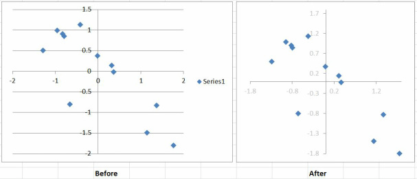
You will notice that the perceptual map looks ugly - hence, it is a "draft". You may want to do the following to make it proper for business consumption:
The map should look more or less like this:
- Remove unnecessary axes: Keep only the X-axis and the Y-axis. Remove all other lines by selecting them and clicking Delete in your keyboard.
- Remove the legend: The legend is unnecessary in this context. Delete it.
- Make all axes of equal size: Select the X-axis, then click "Format Axis". In "Minimum" and "Maximum", select "Fixed". Choose a number that is about as big as the biggest number in BOTH coordinate columns. In this case, let's select -1.8 and 1.8, respectively. This draws the proper boundaries for the map so it looks "square". Repeat for the Y-axis.
- Make the map an actual square: The map as it was drawn looks rectangular. You may want to play with it until it looks square enough.
The map should look more or less like this:
Although ordinarily you should also delete the numbers along the axis (or make them white), I left them greyed out. But... which brand is which? The finishing touch involves determining this.
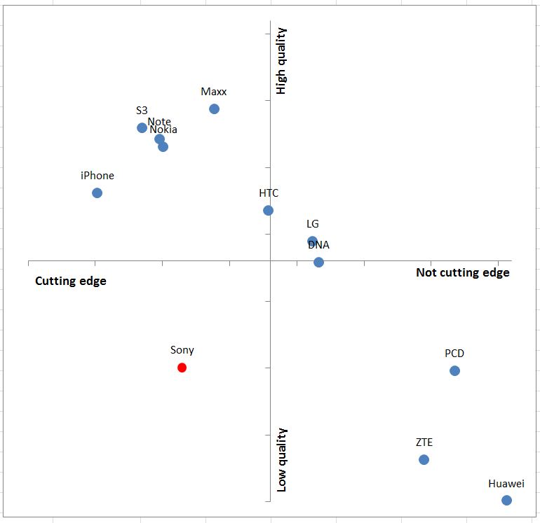
That's it! Here is our perceptual map of the cell phone market:
This map seems to make sense: cheap, mostly obsolete phones are on the "Not cutting edge + Low quality" quadrant. More modern, expensive phones like the iPhone 5 are in the "High quality + Cutting edge" quadrant. What's the problem with Sony, the brand that is highlighted in red? Turns out the Sony Xperia Ion, although impressive in its looks, was a fluke as reported by CNET.
This concludes our analysis. This is our perceptual map. However, this doesn't mean we're ready yet. We need to position our new entrepreneurial brand!
This concludes our analysis. This is our perceptual map. However, this doesn't mean we're ready yet. We need to position our new entrepreneurial brand!
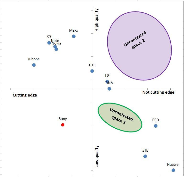
Ideally, you must position the entrepreneurial brand in a space that is devoid of competition - the ideas behind Blue Ocean Strategy come to mind. However, not every uncontested space is appropriate to launch the entrepreneurial brand - just ask Sony and their Xperia Ion! Therefore, a good approach to position your entrepreneurial brand could be:
- Identify the least competed spaces in the perceptual map.
- Determine which spaces should be ignored (e.g. low quality and cutting edge, which is probably contradictory).
- Score the remaining spaces according to how attractive they are in terms of profitability, expected market growth, expected profits, fit with your company, and so forth.
If the entrepreneur positioned his or her product around Uncontested Space 1, there are several problems. First, there seems to be a clear clustering of offerings: cheap (PCD, ZTE, Huawei), medium (LG, HTC, DNA) and premium (iPhone, S3, Note, Nokia, Maxx). Consequently, the entrepreneur may be stuck in a place where differentiation would be challenging to communicate.
Consider now Uncontested Space 2. This calls for a simple (not cutting edge!) phone which is of high quality. The Nokia 3310 of old comes to mind:
Consider now Uncontested Space 2. This calls for a simple (not cutting edge!) phone which is of high quality. The Nokia 3310 of old comes to mind:
The entrepreneur could successfully launch a cellphone that is simple to use yet perceived as high quality. One example of a company that's successfully positioning their whole product line along these lines is Consumer Cellular, a firm that targets senior citizens and offers simple to use, quality (i.e. branded) phones. Most of these phones are also slightly "fat", which could suggest durability.
Remember, perceptual maps are that - perceptual! These maps are about what customers think of products, so they may not always correspond with the actual physical attributes of the product. If so, this could suggest the entrepreneur is not appropriately communicating what the attributes of the product are!
Remember, perceptual maps are that - perceptual! These maps are about what customers think of products, so they may not always correspond with the actual physical attributes of the product. If so, this could suggest the entrepreneur is not appropriately communicating what the attributes of the product are!
- Average: Use function =AVERAGE in Excel, then select the column you want to take an average from.
- Standard deviation: Use function =STDEV in Excel, then select the column you want to take the standard deviation from.
- Standardize variables: Obtain the average and standard deviation of the column you're interested in. Then transform the variable you're interested in into its standardized counterpart by applying the following formula:
Standardized variable: (Original variable - Average of its column)
-------------------------------------------------------------------
Standard deviation of its column
|
Office: BSA 514 |
Tel: 330-672-2170 |


